Gray had a long run. But if your home feels a little cold or flat lately, you’re not imagining it—design is shifting toward warmer neutrals like cream, putty, and soft off-white.
Recently, the color trend toward neutrals has shifted from gray to cream due to a desire for warmer tones. People want to create spaces that are visually quiet and earthy, providing a laid-back feel in an otherwise busy world.
Prestige Stone Products values staying up to date with current color trends by adding them to our catalog. Our stone products catch your eye because they offer something for everyone.
Gray’s Reign Changes
Things change, and so does the appeal of colors. Gray has long reigned as a top choice in home design. The way you want your home to feel depends a lot on the color palette you choose. Gray had a good run and is still the choice for some homeowners.
However, cream colors create a cozier, warmer atmosphere, helping people feel relaxed. Exploring the many shades of cream shows why gray is no longer the default color for everyone.
The Color Trend Shift from Cool Gray to Cream
Creams are associated with warmth, comfort, and softness. Being surrounded by cream and colors alike in a room often makes it feel less sterile and more livable. Cool grays often convey a modern, orderly, minimalist feel. Both cool grays and warm creams can be authentic to a space, but creams bring out earthy undertones that display the vibrancy of life.
Shifting from gray to cream means returning to softer and friendlier tones that complement natural lighting. Below, you can see some naturally warm colors, such as cream, and some closely related ones. They evoke soothing feelings of ease and calmness.
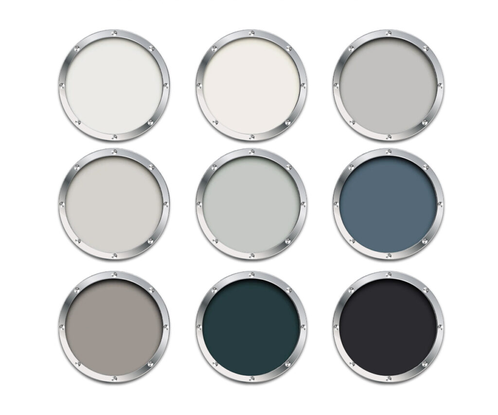
Cream: pale yellow

Off-white: near pure white

Beige: pale, gray yellow
Taupe: mix of gray & brown

A 60-Second Guide to Undertones: Cream Isn’t Just One Color
The undertone of a color can be warm, cool, or neutral. Warmer and cooler undertones lean toward specific colors, while neutral tones blend and balance these colors.
Here’s a list of undertones for the colors we saw above.
- Cream: warm (yellow, peach, gold) — cool (pink, red, blue)
- Off-white: warm (red, beige, yellow) — cool (blue, green, gray)
- Beige: warm (gold, yellow, red) — cool (green, gray, pink)
- Taupe: warm (yellow, orange, red) — cool (purple, blue, green)
Undertones reveal themselves quickly, so it’s important to think about them when
deciding how you want your space to feel. They should also complement your decor.
These various undertones create different feelings in your home.
- Yellow & gold give off a smooth, creamy feel.
- Pink & peach give off a soft, cozy vibe.
- Green gives off a natural, organic feel.
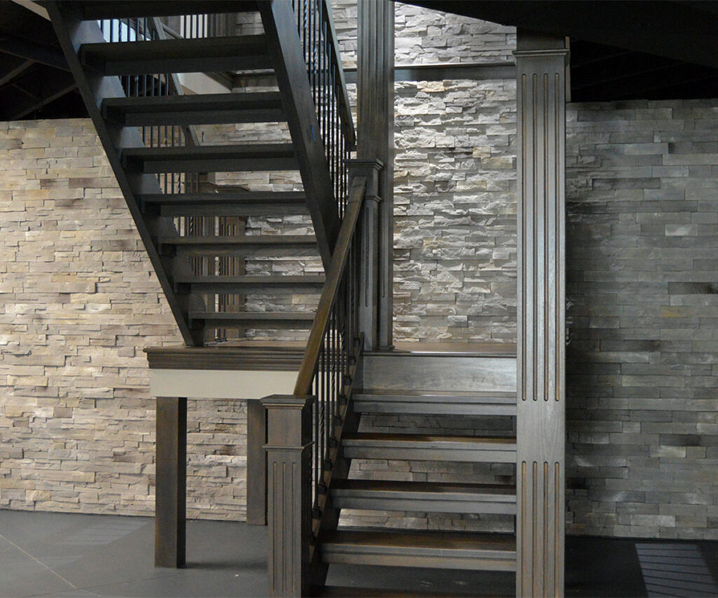
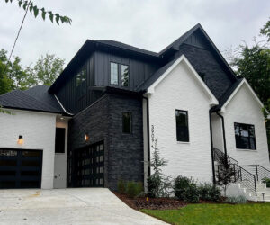
Why Stone Veneer
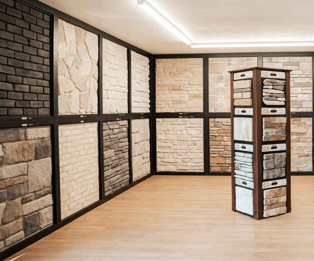
We like to add lasting beauty with natural-looking stone. At Prestige Stone Products, relationships and customer service are important to us. So, we know that staying up to date with current color trends will provide more options for our customers. Our passion is to produce stone veneer that meets everyone’s various color choices.
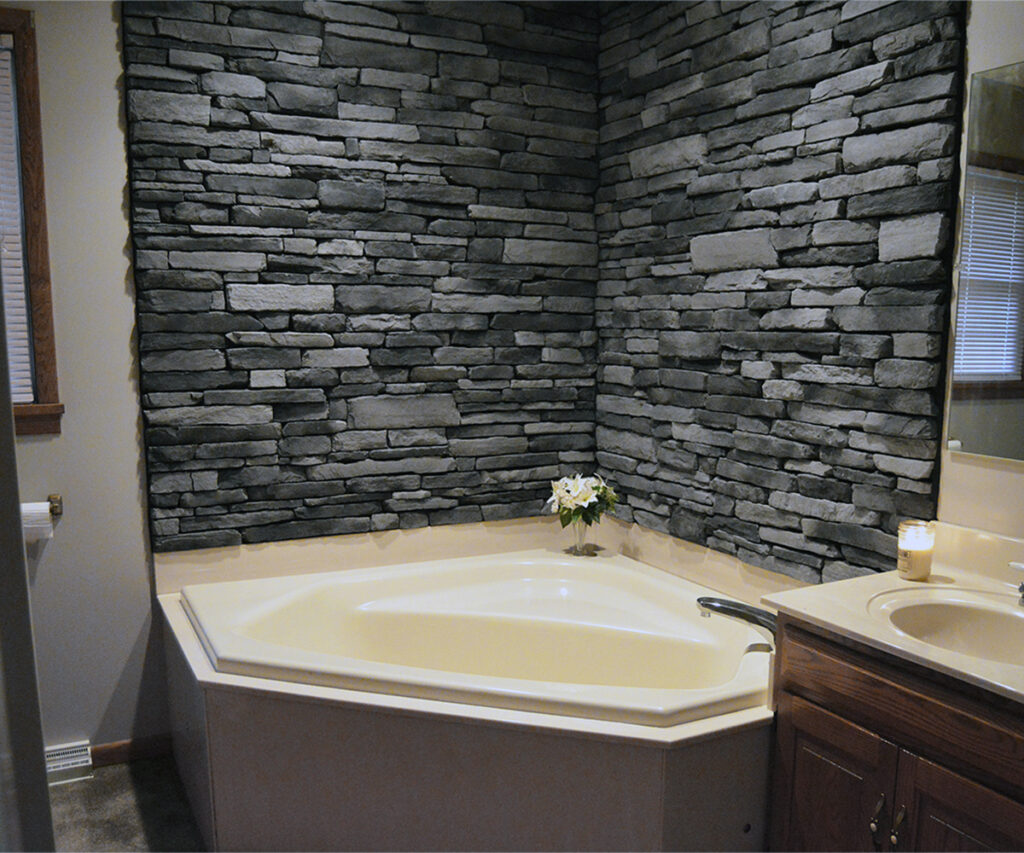
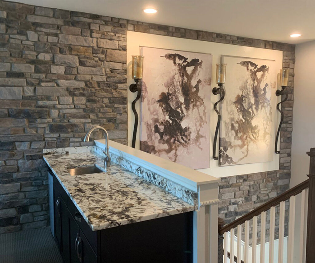
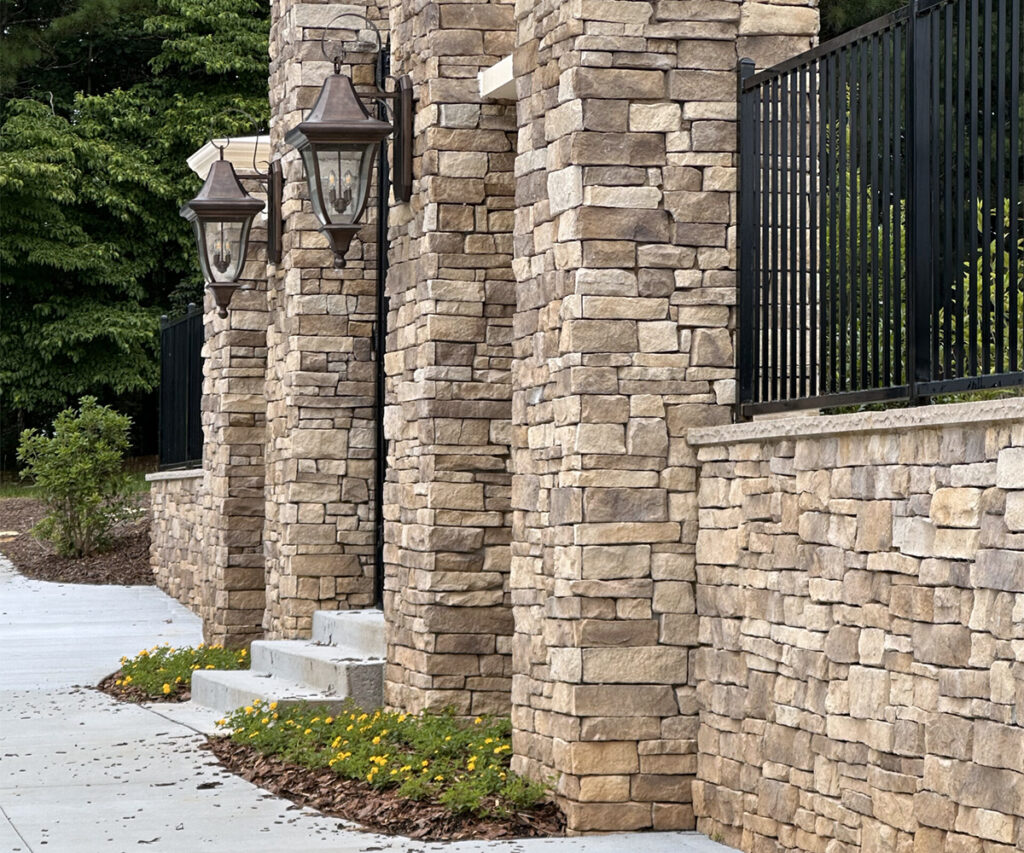
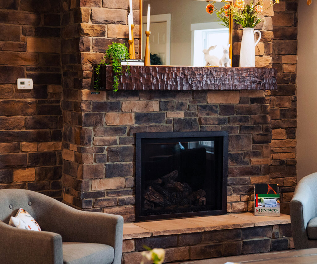
Stone veneer is a cost-effective, versatile, and low-maintenance alternative to natural stone. Installing it as an interior accent wall, for exterior appeal, or to update spaces near the fireplace can add value to your house.
It’s a great option for creating character in and around your home. Adding a new focal point can improve architectural design. Where do you want guests to see that extra care has been put into the details? It’s not meant to be the main part of your house, only a unique nod to your intentional style.
Stone Veneer Color Selection
Now that we’ve considered color, how does it affect your stone veneer selection? Stone veneer has a natural texture that casts shadows, making colors look richer. Outdoor light changes throughout the day, but undertones reveal themselves quickly. Various elements around your house, such as the roof, siding, trim, and accent areas, affect its overall look. Location factors into it, too.
Choose stone veneer that complements your house’s architecture. The goal is to give your home a boost, make it something you’re proud to own, and provide a layer of protection.
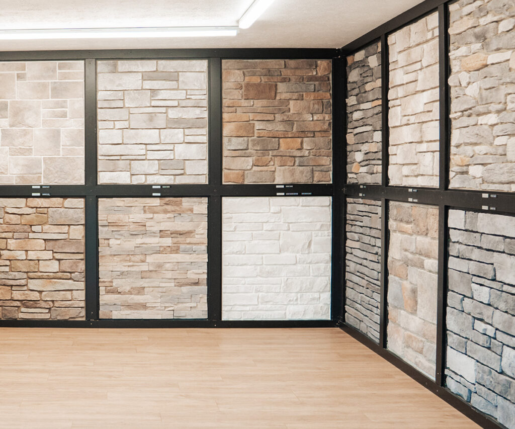
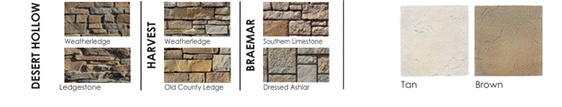
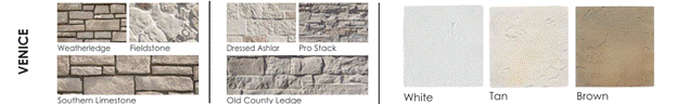
Here at Prestige Stone Products, we offer a wide range of design options from our stone veneer collection. Our Reference Guide provides a peek into these.
‘Bridge Colors’: Making the Change from Gray to Cream
Your style matters, and so do the interior and exterior designs you envision for your home. If you already have gray but want to make the switch to cream, use bridge colors for this transition.
Small changes can be just as significant as big ones. Choosing creamier neutrals might be a good way to spruce up your place. It’s more than a routine spring cleaning; it’s something that will bring delight year-round.
Is Your Home Already Gray-Heavy?
We recommend transitional neutrals that don’t fight gray trim or roofing. For example, Blanc (101) from our line is a lighter, softer steppingstone away from darker, cooler grays.
Do You Want to Go Fully Warm?
Our off-white and cream-forward options, such as Luna and White Onyx, are great ways to do this. Luna is perfect for a cream-and-off-white direction. White Onyx is cleaner and whiter.
Do You Want Warm-but-not-too-light?
We have light tan and brown neutrals for a safe, warm choice. These lighter warm neutrals include Siesta, Venice, and Braemar.
Ready-Made Palette Pairings
Modern Farmhouse, Soft Modern, Traditional Warm, and Contemporary are some themes you can explore. When you style your home around a theme, it’s easier to buy matching decor that can be used year-round. Mix and match what you have to make your space fun to live in.
Below are colors that pair well with each theme, suggested veneer, and complementary elements.
Modern Farmhouse
- Colors: cream with dark brown or black
- Veneer: cream/off-white
- Elements: black windows/roofing & warm wood doors
Soft Modern
- Colors: warm neutral with white or gray
- Veneer: cream/putty
- Elements: bronze/charcoal accents & natural woods
Traditional Warm
- Colors: white or light brown
- Veneer: warm neutral
- Elements: brick accents & dark brown trim
Contemporary
- Colors: grays
- Veneer: transitional neutral
- Elements: charcoal roof & warm white trim
Choosing Confidently
Make the right choice so you can enjoy your place for months and years to come. Write down some key points for your next big home design or renovation decision based on the lists below.
Checklist
- What will look good with my roof, siding, brick, or hardscape?
- What direction is the wall facing?
- Am I creating an accent for a specific area of my house?
- Do I want to add a new focal point?
Tips
When working with a color sample of stone veneer:
- View in the morning, at noon, and in the evening.
- Compare the next trim and roof sample.
- Expect variation because stone is not a flat paint chip.
Looking for more on choosing the right color?
Check out one of our previous blogs on Choosing the Right Veneer Colors.
Curious about how the sample looks compared to the installation?
Here’s our blog on Why is the Veneer Darker than the Sample.
Takeaway

We look forward to helping you with your vision for your home. Make it come to life by considering stone veneer. It’s an investment that adds both value and character.
Selecting the right color can be challenging when planning a renovation or home improvement. It’s helpful to know that warm neutrals are a popular color trend because they’re easier to live with and style long-term.
We offer several color combinations with our stone veneer selection to ensure quality, durability, and craftsmanship. Choose neutral colors like cream to create a lasting love for your home.
Table of Contents
More From the Blog
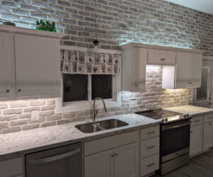
Can Stone Veneer Be Used Inside Your Home?
Stone adds a rustic elegance to any home’s exterior, but what if you tried to use stone veneer inside your…
A Homeowner’s Guide to Stone Veneer Fireplaces
If you’re a homeowner looking to make your fireplace more inviting, a stone veneer fireplace surround can be a beautiful…
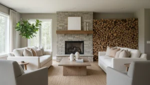
How to Choose the Right Veneer Colors
Stone veneer has grown in popularity over the years due to its visual appeal and function. Here at Prestige Stone, our…